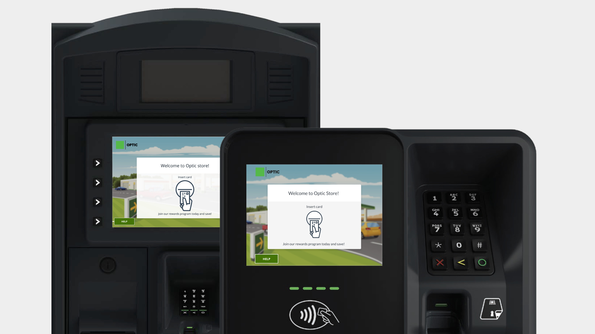
Add chip card payment capabilities to the system and user flow primarily from an interaction, usability, and content standpoint.
Adding chip card support introduces a different customer experience, since users will have to leave their card inserted at the pump—as opposed to quickly inserting it and removing it.
To change the user’s mental model, it was essential to improve the messaging used within different screens in the app; intentionally informing the user of the different system states and activities.
This was a bit of a personal challenge, as there exist no pay-at-the-pump technologies at fueling pumps in India so I had no frame of reference.
(My team helped me hit the ground running by providing videos and other documentation necessary for me to understand the user journey and flow completely, which was very valuable. So Kudos to them!)
The approach began by defining a proper user flow in the form of a user journey map, in collaboration with the product team and subject matter experts, while suggesting appropriate messaging to be used for each step in the journey.
Our UX writer recommended appropriate messaging for each step in the user journey so the user may complete their task as quickly and easily as possible.
This had a vital role to play in the visual design, as it had shaped my approach to designing the interface.
Our approach was completely based around content, and visuals were added mainly to support/enhance the messaging.
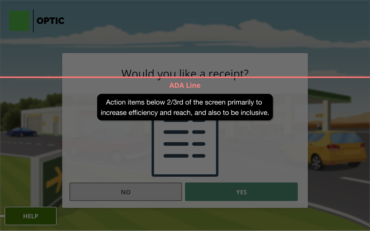
The intent behind the layout design was to reinforce the messaging used in the flow by establishing a proper content hierarchy through typography so that the user is naturally guided from viewing the context to performing an action.
Animations and illustrations were designed to match the content shown on the screen as a visual aid to the user and provide them with a little additional context.
All actionable items were placed below the 'ADA line', an imaginary reference line we applied to the interface — in order to offer interactivity to people with disabilities.
Color was contrast checked and color-blind tested, and spacing was optimized, with the layout designed by placing emphasis on the content in the centre to account for environmental conditions, screen calibration sensitivities, and peripheral vision challenges for our users.
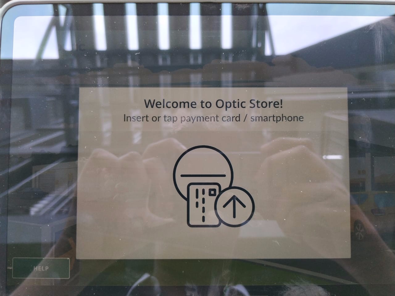
In line with accommodating accessibility principles relating to color contrast and visibility, I tested the interface outdoors by porting the screen to the closest equivalent screen to a point of sale—an iPad, at different cycles of iteration.
The intent here was to simulate the outdoors and see how the interface might be perceived at different lighting conditions.
This gave us a rough idea as to how colors present in the interface might look in the real-world. Included below are sample images from my test at different times during the day. Conducting these tests by taking the interface outside gave me a sense of adjusting color values at different points during the visual design process.
Participants were able to perform their tasks with ease. The screens received a mean rating for 4.52 out of 5.
Participants found the screens attractive, with a mean for attractiveness measured at 4.29 out of 5.
I realised the importance of working with great copy, thanks to an amazing UX writer in the team (Thank you, Morgan!), as it helped me design visuals faster.
This was my first time working with a service designer, and it really opened my mind to different intangible aspects of the design process, such as considering the whole journey and the different consumer touchpoints along the way.
I spent a lot of time studying accessibility principles and branding do's and dont's and applied them to this project.
→ Next project