Reducing errors in high-pressure kitchens
A kitchen display redesigned for order clarity mid-service.
Problem
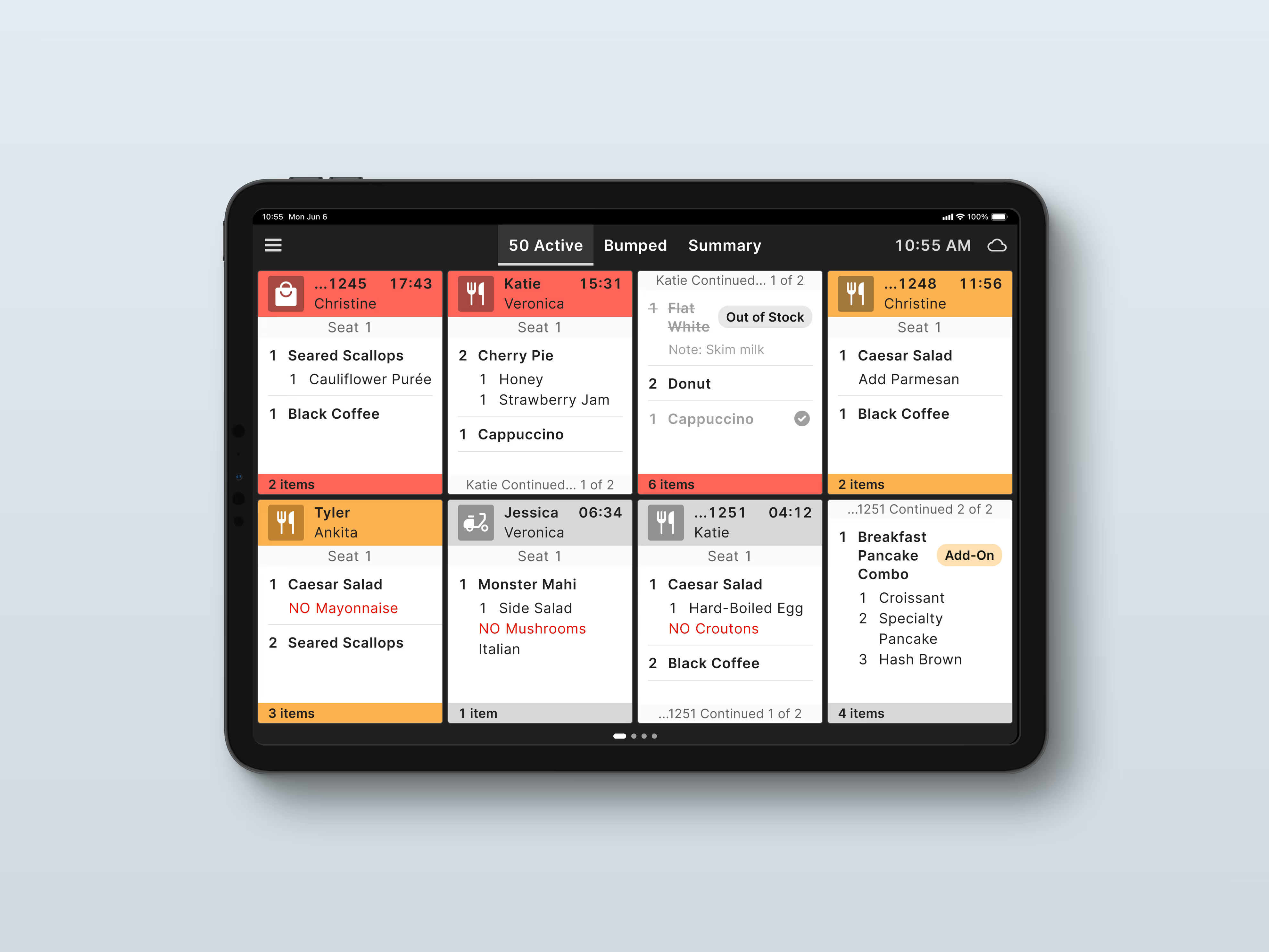
When an order is placed at the Point of Sale (POS), it shows up on the Kitchen Display System (KDS). Line cooks and expediters run the line from that screen. NCR's was outdated, and the kitchens it lives in are loud, messy and fast.
Each ticket had to hold a lot of detail: table numbers, statuses, modifiers. Cooks had to read it from three feet away, with gloves on or wet, greasy hands.
Approach
I started with research. I audited competitors and built personas for line cooks and expediters. Then the PM and I ranked features by impact and effort. Rush, refires, reprint and tagging came first. Customer messaging and splitting courses across tickets didn't. Kitchen surveys told us what belonged on a ticket, and everything else got cut.

Then I designed the core actions: bump, rush, recall and refire. Cooks work under steam and noise, so a tap completes a routine ticket and a long press changes its priority.
Key decision
Two things pulled against each other: how much detail a ticket could hold, and how far away it could be read. I chose readability and let everything else follow.
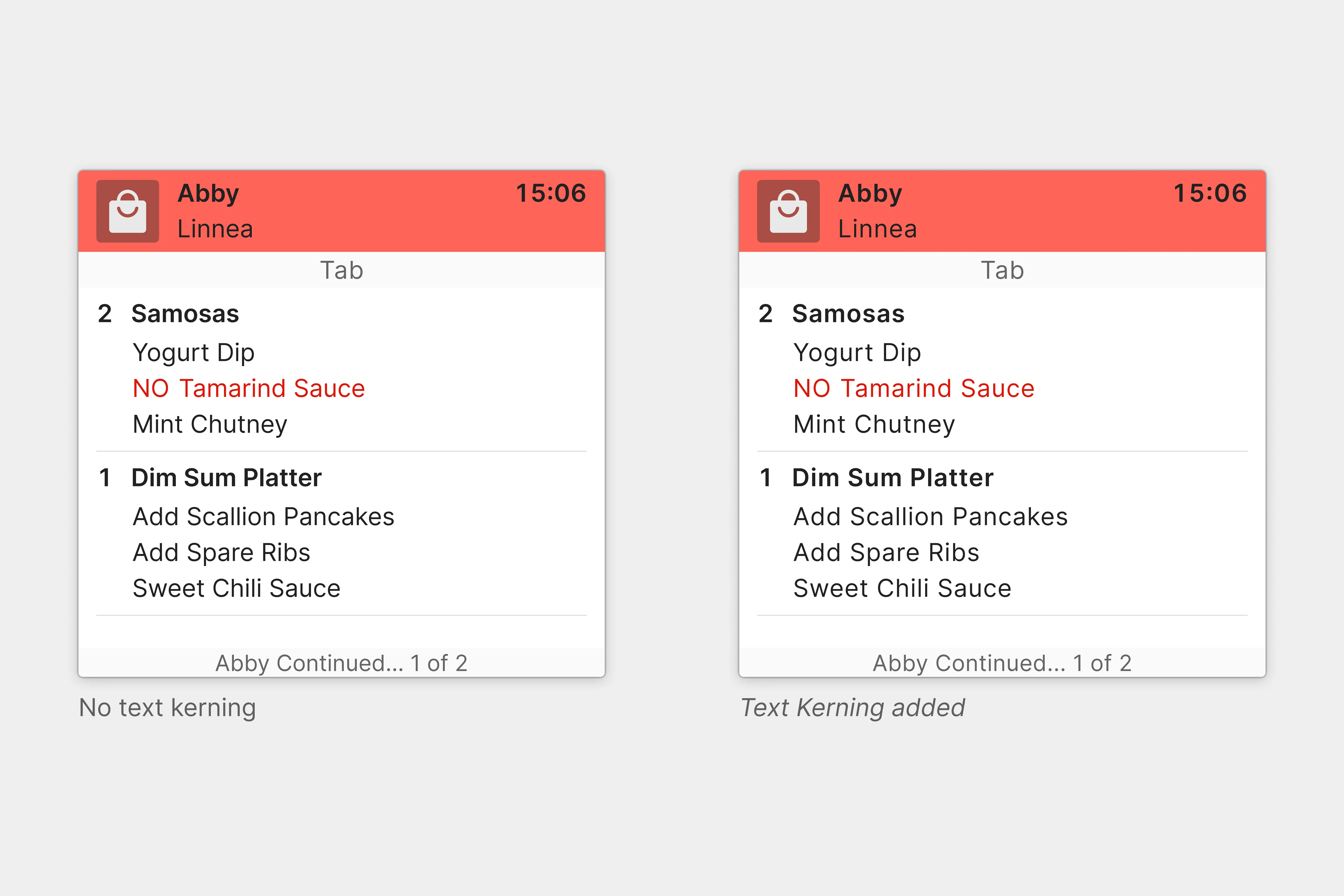
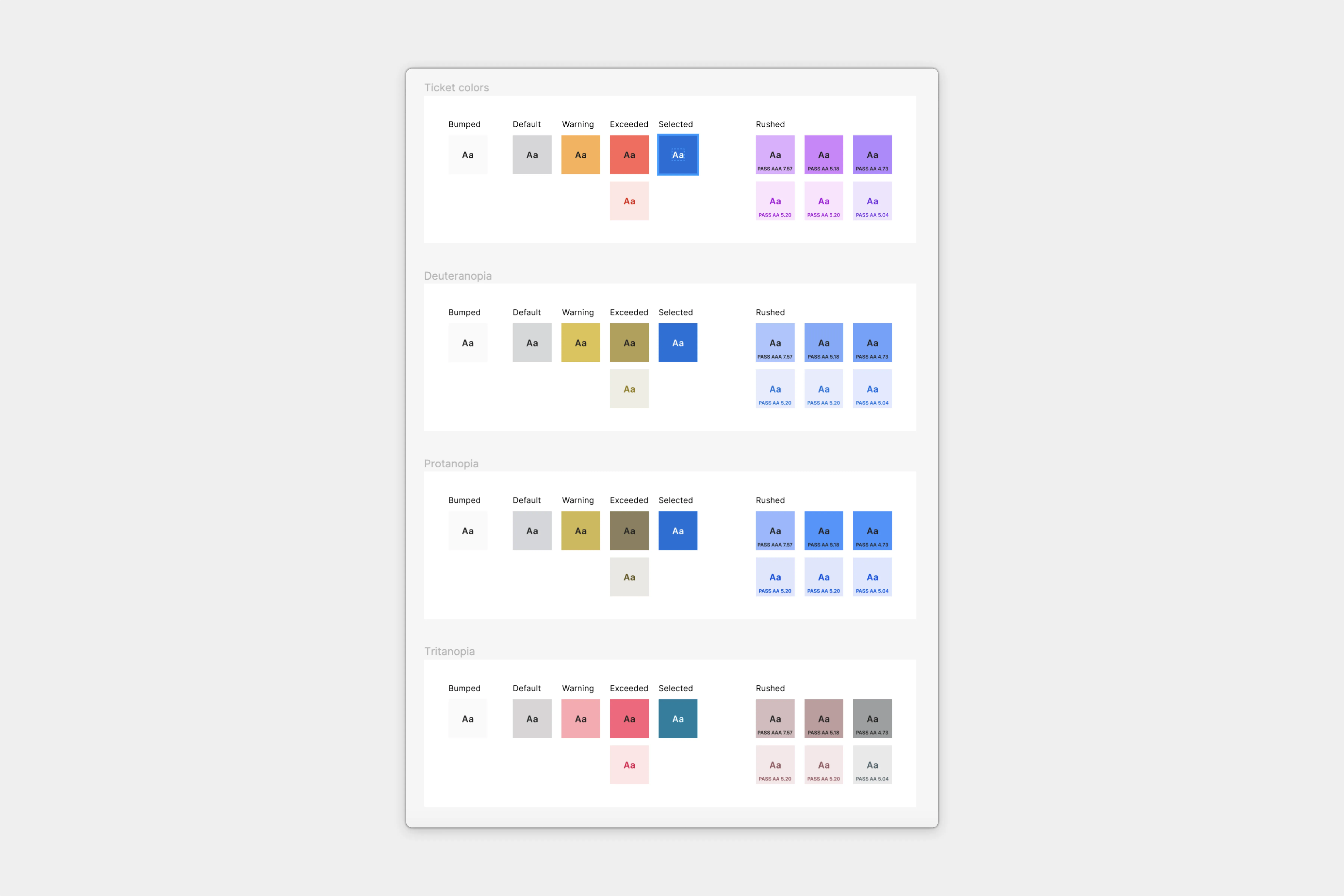
Cooks read tickets from across a loud kitchen. We tested readability with them remotely, and I added kerning so letters stay distinct at a distance, the way road signs do. Their hands are gloved or wet, so I made the touch targets bigger. Status colours mean something here (rushed, exceeded, bumped), so I pushed contrast to WCAG AA and checked how the colours look to colourblind cooks.
Outcome
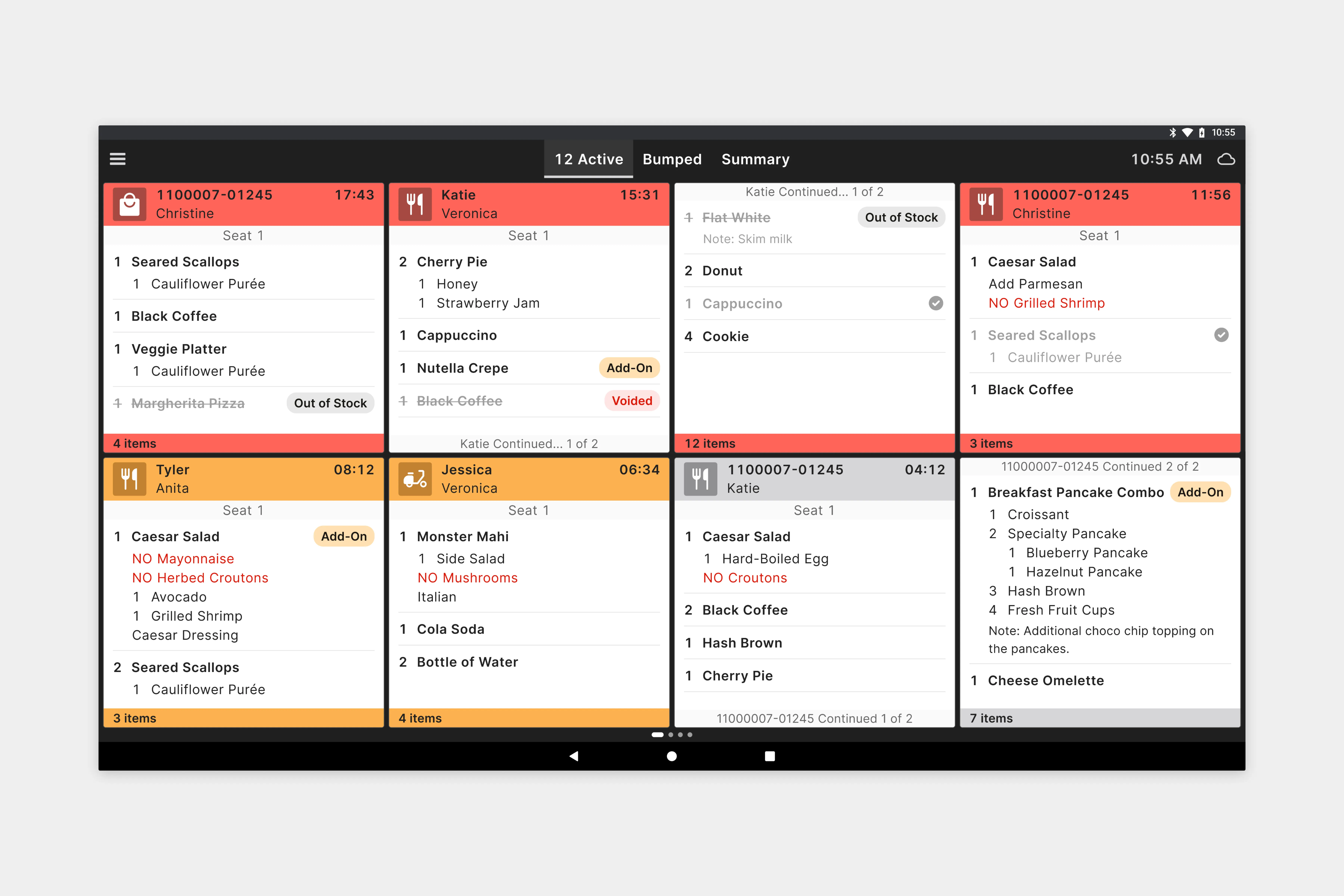
I left NCR before this launched, so it never ran on a real line. But I designed it for a cook who glances at the screen in the middle of a rush. Rushed tickets move and change colour. Voided items, out-of-stock flags and modifiers are easy to spot. If it had shipped, I'd count how many orders got missed during service.